Vintage Wedding Color Palettes That Feel Timeless
Nothing gives away a vintage wedding faster than the wrong color palette and nothing sells the aesthetic faster than the right one. Vintage wedding colors share one thing in common across every era: they look faded or patinated rather than fresh and bright, like something “found in a drawer” instead of picked off a paint chip. Here’s how to choose the right palette for whichever era you’ve chosen, with specific color combinations for each.
The Golden Rule of Vintage Wedding Colors
Before picking specific shades, it helps to understand the one principle that applies across every vintage era: aged, layered, and richly toned colors read as authentically vintage, while sharp, high-contrast, fully saturated colors read as modern no matter what decor you pair them with. If you’re ever unsure whether a color fits your palette, ask whether it looks “sun-faded” or “freshly painted”. Vintage always leans toward the former.
Art Deco Color Palette
Art Deco is the one vintage era that embraces bold contrast rather than softness. The most popular combination is black and gold, often layered with rich jewel tones like emerald, sapphire, or ruby for extra depth. Metallics, like gold, silver, and bronze are just as important as the colors themselves, since Art Deco relies on shine and reflection as much as hue.
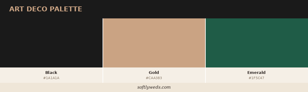
Core palette: Black, gold, and one jewel tone (emerald, sapphire, or ruby).
Victorian Color Palette
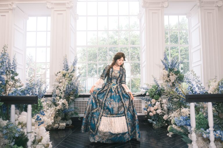
Victorian palettes lean into deep, romantic richness. Burgundy, emerald, royal blue, and deep purple form the core of the look, typically balanced with lighter classic tones like ivory, cream, and gold so the palette doesn’t feel too heavy. Some couples take a softer approach with blush, dusty rose, and sage instead of the deeper jewel tones. Both are historically accurate, so the choice comes down to how dramatic you want the day to feel.
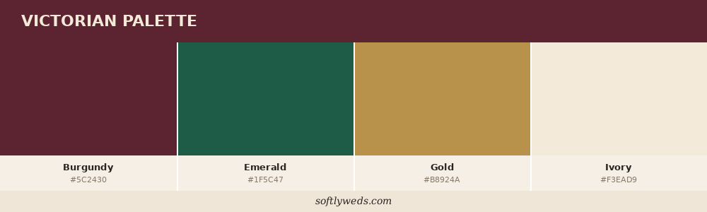
Core palette (rich version): Burgundy, emerald, and gold, softened with ivory.
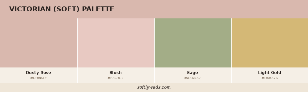
Core palette (soft version): Dusty rose, blush, and sage, with light gold accents.
Mid-Century Modern Color Palette
Mid-century palettes are confident and warm rather than pastel or muted. Rust, olive green, mustard yellow, and teal form the backbone of the look, often paired with crisp white or charcoal for contrast. Florals in this era lean toward coral, orange, and copper tones, echoing the decade’s love of bold, saturated color used with restraint.
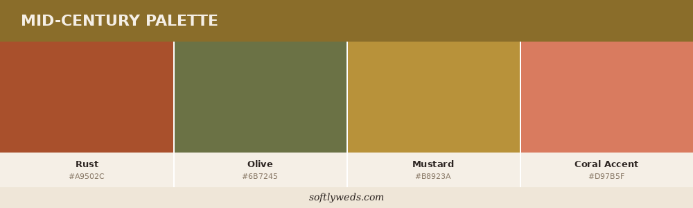
Core palette: Rust, olive, and mustard, with teal or coral as an accent.
Edwardian Garden Party Color Palette
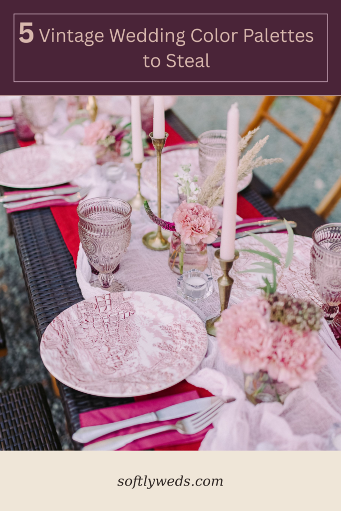
Edwardian palettes are the softest of all the vintage eras. Think antique rose: dusty rose, warm ivory, aged gold, and muted green. This is one of the most universally flattering vintage palettes, since its soft, faded tones work well across nearly any skin tone, season, and venue style.
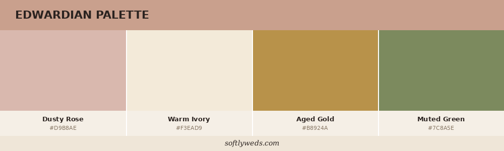
Core palette: Dusty rose, warm ivory, aged gold, and muted green.
1970s Boho Color Palette
The 1970s palette is warm and earthy, built around orange, yellow, olive, and brown. Sun-soaked tones that suit outdoor, natural settings especially well. For a more disco-glam take on the era, layer in metallics like copper and bronze alongside deep jewel accents for evening drama.
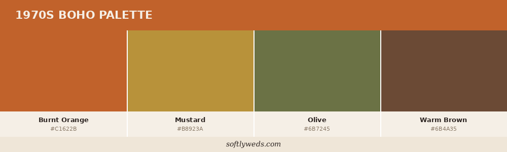
Core palette (boho version): Burnt orange, mustard, olive, and warm brown.
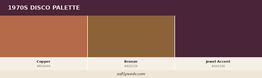
Core palette (disco version): Copper and bronze metallics with a deep jewel-tone accent.
How to Build Your Palette Once You’ve Chosen an Era
- Pick one dominant color and two to three supporting tones. Giving every color equal weight tends to look chaotic; one lead color reads as far more intentional.
- Test the palette against real materials. Fabric swatches, flower samples, and place-setting photos laid out together give a much more accurate sense of the final look than a flat digital color chart.
- Check how the palette reads in your venue’s actual lighting. Deep, rich palettes rely on warm, low light to look their best; soft pastel palettes benefit from natural daylight.
- Apply the palette consistently across at least three elements – florals, tablescape, and stationery – so it reads as a deliberate choice rather than an accident.
Key Tips
- Favor aged, muted tones over bright, saturated ones. That’s the single biggest signal of an authentically vintage palette.
- Metallics matter as much as color for Art Deco and 1970s disco-glam styling.
- Choose one dominant color per palette and treat the rest as supporting accents.
- Match your palette’s richness to your venue’s lighting. Deep tones need warm light, pastels need daylight.
- Carry your palette across multiple elements, not just the florals, for a cohesive look.
Frequently Asked Questions
What makes a color palette read as “vintage” rather than just colorful?
Faded, muted, or aged tones read as vintage. Bright, high-contrast, fully saturated colors read as modern.
Can I use a vintage color palette for a modern venue?
Yes. Palette and decor can carry the vintage feeling even without a period-specific venue, though a venue with some existing character will always make the palette read more convincingly.
Which vintage palette works best for a fall wedding?
Victorian’s rich jewel tones and mid-century’s warm rust-and-olive combination both suit fall especially well, since their depth matches the season naturally.
Which vintage palette works best for a spring or summer wedding?
Edwardian’s antique rose palette and the boho version of the 1970s earth-tone palette both work beautifully in warmer, brighter months.
Can I combine two eras’ palettes?
You can, but it’s easiest to pick one era’s palette as your base and borrow just an accent color from another rather than blending two full palettes evenly.
How many colors should be in my palette?
Three to four is usually the sweet spot. One dominant color, one or two supporting tones, and a metallic or neutral to tie everything together.
Do I need to match my dress to my palette exactly?
No. Most vintage gowns are ivory, white, or a soft neutral regardless of era. Your palette shows up in your decor, flowers, and stationery rather than your dress color.
What’s the most budget-friendly vintage palette to source?
Mid-century and 1970s earth tones tend to be easiest to source affordably, since warm, muted colors are common in secondhand decor and rentals.
How do I know if my chosen colors will look good in photos?
Test your palette against real materials in your venue’s actual lighting before finalizing anything. Colors that look right on a screen don’t always translate the same way in person.
Should my palette change between ceremony and reception?
It doesn’t need to, but many couples use a slightly softer version of their palette for the ceremony and a richer, more saturated version for the evening reception.
Build Your Palette Next
Once you’ve chosen your era’s core colors, the next step is applying that palette everywhere it matters – from your florals down to your stationery. For inspiration on translating your palette into full styling, revisit 50 vintage wedding ideas for every era.